Graffiti typography / Studio Work
Secret Typography
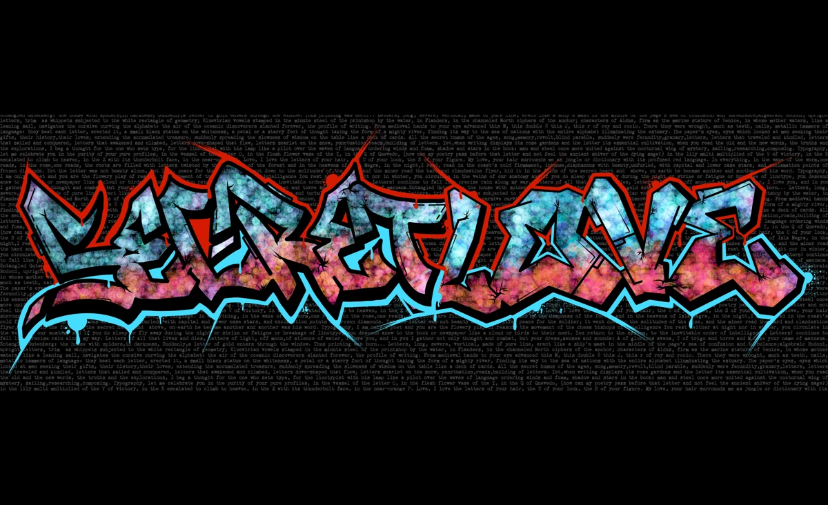
An experimental studio piece that treats graffiti as revolutionary typography: graffiti letterforms 3D-modeled, printed, and hand-finished over Pablo Neruda's Ode to Typography, and shown as a gallery installation.
Role
Concept Artist, 3D Modeler, Visual Designer, Fabricator
Start Date
January 2025
End Date
April 2025
Client
Senior Capstone (academic)
01
The Concept
I've been drawing graffiti since I was young.
The design world tends to look past it. Graffiti gets filed under street style or rule breaking, the kind of lettering you're meant to grow out of, not the kind you study. I never saw it that way.
Then I read Neruda's Ode to Typography. The poem treats the letter not as decoration but as something alive: a vessel for emotion, a force that has fueled revolutions. It put language to what I already felt. Graffiti isn't lesser typography, it's revolutionary typography.
Secret Typography is my adaptation. It brings that overlooked history into the light and honors the role graffiti has played in shaping the world.
Yet the letter was not beauty alone, but life, peace for the soldier; it went down to the solitudes of the mine, and the miner read the hard and clandestine flyer.
Where the letter has spoken
- 1968The Paris uprising
- 1980sThe fight against Apartheid
- 1989The Berlin Wall
- 2011The Arab Spring
- 2020Black Lives Matter
02
The Process
The assignment was to take an old project further. I took mine off the screen.
Our senior capstone was to take a project from earlier in the degree to the next level, then stage it as a real display at the year-end gala. I came at it from both of my majors, graphic design and studio art, so going further meant building it in the physical world.
Most of it was fabrication. I ran the vinyl cutter, modeled the letters in CAD and 3D-printed them, and cut the keychains on the laser. It's all still graphic design, just with hard rules and technical setups instead of an undo button.
The gala is also where students meet the people who hire them, so the installation had to introduce me as much as the piece. That's what the printed portfolio book and the take-home QR keychains are for.
- January · The brief
It started as a written brief: Neruda's Ode to Typography and graffiti's revolutionary history, scoped into something I could actually build and hang.
- February · Design & dial-in
Refined the graffiti letterforms in Procreate and fine-tuned the graphic elements in Photoshop, then planned materials and machine time in the DigFab lab. Measured for the laser cutter and the wall, proof-printed to lock the 3D scale, and started modeling the letters in Rhino.
- March · Fabrication
Drew an invented city skyline in Illustrator and cut it on the vinyl cutter; 3D-printed the letters on a Prusa: test, troubleshoot, final. Laid out the final prints in InDesign, layered over the Neruda poem.
- April 19 · Assembly & install
Glued the sized 3D letters onto the printed posters and hand-painted them into the composition. Laser-cut the take-home wooden QR keychains, then installed everything on installation day.
03
Signature Move
What makes this project distinct
A poem you can touch
Modules
- Supporting Artifacts
The principle
Nothing here is by accident — every detail is a decision.
Need help with your studio project?
04
The System / Deliverables
05
Outcome
There's no conversion rate on a poem. Secret Typography was made to be seen, felt, and carried home.
Let's collaborate
Have A Project In Mind?
I help brands and businesses build strong identities, campaigns, and digital experiences that make an impact.